Flexbox, una alternativa a Bootstrap, permette di affrontare sia il problema della "responsiveness" che quello di creare layout basati su grid layout.
Flexbox ha alcuni concetti fondamentali che, se applicati dall'alto verso il basso (top-down), aiutano a creare layout anche complessi con una certa facilità.
Si inizia pensando al proprio layout complessivo come a un contenitore flexbox, per poi approfondire i singoli componenti. La barra di navigazione si impostate con flexbox. L'area principale e disegnata con flexbox, e così anche le schede informative.
Alcune delle risorse più efficaci:
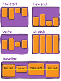
Flexbox - The Ultimate CSS Flex Cheatsheet
How to put a div in the center using Flexbox
DevEd - Youtube
Traversy Media - Youtube
Guida completa a Flexbox - css-tricks.com
Le considerazioni dietro un layout Flexbox - css-tricks.com
The peculiar magic of flexbox and auto margins
Flexbox — The Animated Tutorial
Add new comment